How to Choose Your Wedding Day Color Palette for Photos
- Parul Singh
- Dec 17, 2025
- 3 min read


Choosing the perfect color palette for your wedding is about more than just matching your décor—it’s about creating a cohesive look that enhances your photography. Your colors influence the mood of your wedding, complement your venue, and make your photos pop. For couples in Chicago, working with a Chicago wedding photographer who understands color and lighting can make a huge difference in achieving beautiful, timeless images.
1. Start with the Season
Seasonality is a natural guide for your color palette:
Spring: Soft pastels, blush pinks, light greens, and lavender complement blooming flowers and fresh landscapes.
Summer: Vibrant colors like fuchsia, royal blue, and sunny yellows match bright outdoor settings.
Fall: Deep reds, burnt oranges, mustard yellows, and jewel tones highlight autumn foliage.
Winter: Rich jewel tones, metallic accents, or classic neutrals work beautifully with snowy backdrops and indoor lighting.
Example: I photographed a late October wedding in Chicago. The couple chose a palette of deep burgundy, gold, and cream, which perfectly complemented the fall foliage and warm indoor lighting. The resulting photos were rich, romantic, and cohesive.
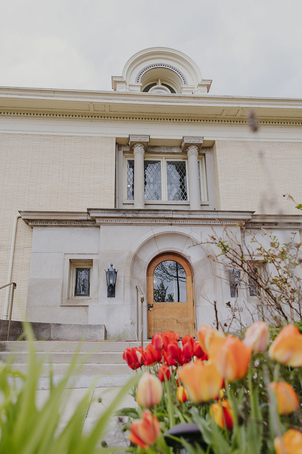
2. Consider Your Venue
Your venue’s architecture, lighting, and surroundings can affect how colors appear in photos:
Indoor Venues: Check wall colors, flooring, and décor—neutral backgrounds allow your color palette to stand out.
Outdoor Venues: Account for natural elements like greenery, water, or urban landscapes when selecting colors.
Lighting: The type of lighting (natural, fluorescent, or warm LED) can influence how colors are captured by your photographer.
Tip: Ask your Chicago wedding photographer to review your color choices in the venue setting. This helps avoid clashing or washed-out tones in your photos.
3. Coordinate with Your Wedding Party
Your bridal party’s attire plays a huge role in visual harmony:
Bridesmaids & Groomsmen: Choose complementary colors for dresses, suits, ties, and accessories.
Mix & Match: Don’t be afraid to mix shades of your main colors for depth and visual interest.
Texture & Fabric: Satin, velvet, and lace reflect light differently, which can enhance photography.
Example: A summer rooftop wedding featured bridesmaids in varying shades of dusty blue and groomsmen in matching gray suits. The subtle variations added depth to the photos without looking mismatched.
4. Incorporate Your Personal Style
Your color palette should reflect your personalities and the vibe of your wedding:
Classic & Elegant: Whites, creams, and golds create timeless, luxurious photos.
Bold & Fun: Vibrant colors like red, fuchsia, or emerald green add energy and excitement.
Romantic & Soft: Blush, mauve, and lavender create dreamy, soft-focus images.
Tip: Collect inspiration from Pinterest boards, wedding magazines, and your photographer’s past galleries to see how colors translate in photos.
5. Don’t Forget Details
Small details make a big difference in photos:
Floral Arrangements: Match your bouquets and centerpieces to your color palette for cohesive imagery.
Stationery & Signage: Invitations, programs, and table signs can reinforce your palette.
Accessories & Décor: Ribbons, linens, napkins, and candles provide subtle touches that enhance your photos.
Example: One Chicago couple incorporated their deep plum and gold color palette into everything—from florals to table linens to even the cake. The photos felt unified, polished, and visually striking.
6. Test Colors in Advance
Mood Boards: Create a mood board with swatches, fabrics, and photos to visualize the palette.
Lighting Test: Take sample photos in your venue’s lighting to see how colors appear on camera.
Photographer Input: Experienced photographers can recommend adjustments to ensure colors complement your skin tones and lighting conditions.
7. Final Thoughts
Choosing a wedding color palette is an exciting step in planning your big day. By considering the season, venue, personal style, and photographic impact, you’ll create a cohesive and visually stunning look. A skilled Chicago wedding photographer can guide you through color coordination, ensuring that every image—from décor to attire—looks harmonious and timeless.
CTA: Want your wedding colors to shine in every photo? Contact Bryte Media LLC today to schedule your Chicago wedding photographer and capture your day in perfect color.
Comments